Typography Basics for Designers
Advertisement
Ad
What is Typography?
Typography is the art of arranging text to be readable, clear, and visually appealing. It's one of the most important skills in design — good type makes or breaks a layout.
Key Terms
| Term | Meaning |
|---|---|
| Typeface | Font family (Helvetica) |
| Serif | Has small "feet" (Times) |
| Sans-serif | No feet (Arial) |
| Kerning | Space between letters |
| Leading | Space between lines |
Serif vs Sans-Serif
- Serif — traditional, formal (print, books).
- Sans-serif — modern, clean (screens, web).
Typography Best Practices
- Limit to 2-3 fonts per design.
- Ensure strong contrast for readability.
- Use hierarchy (size/weight) to guide the eye.
- Keep line length 50-75 characters.
Pairing Fonts
Combine a distinctive heading font with a simple, readable body font. Pair a serif with a sans-serif for contrast.
FAQs
How many fonts should I use?
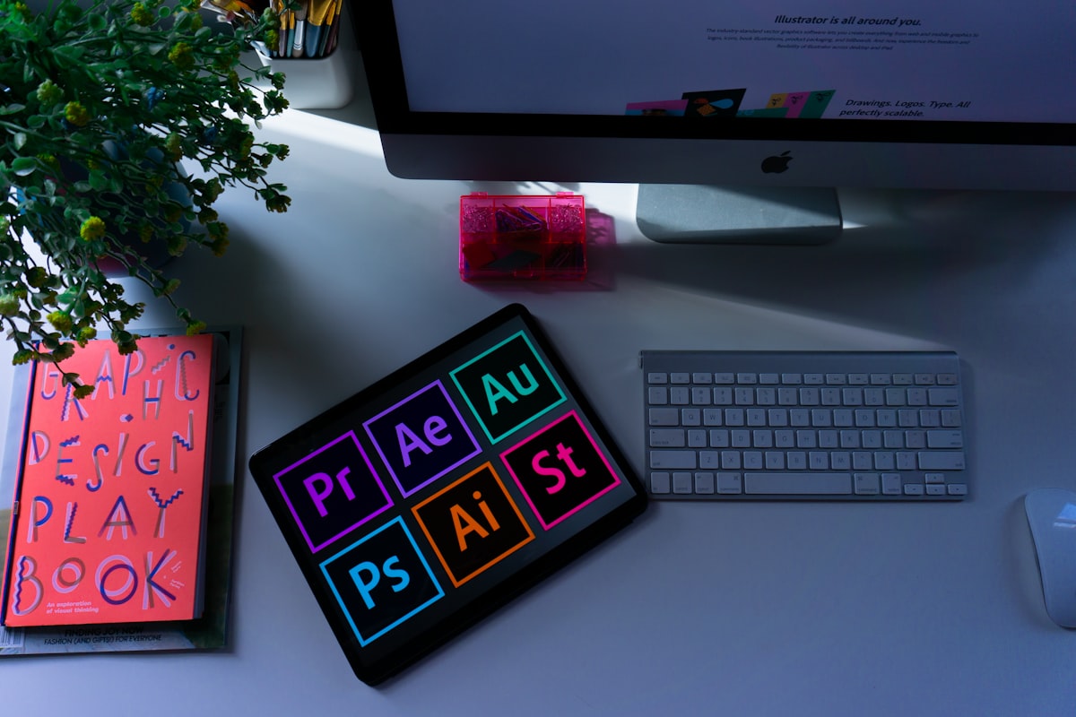
Usually 2 — one for headings, one for body. More in our Graphics Design section.
Where do I find good fonts?
Google Fonts (free) and Adobe Fonts.